Spurious Sparks of AGI
On the Unsurprising Finding of Patterns in Latent Spaces

We humans are prone to seek patterns everywhere. Meaningful patterns have often proven to help us make sense of our past, navigate our presence and predict the future. Our society is so invested in finding patterns that today it seems we are more willing than ever to outsource this task to an Artificial Intelligence (AI): an omniscient oracle that leads us down the right path.
Unfortunately, history has shown time and again that patterns are double-edged swords: if we attribute the wrong meaning to them, they may lead us nowhere at all, or worse, they may lead us down dark roads. I think that the current debate around large language models (LLMs) is a prime example of this.
This article was the original starting point for our recent paper on the topic co-authored with Andrew M. Demetriou, Antony Bartlett and Cynthia C. S. Liem. The paper is a more formal and detailed treatment of the topic and is available here. While this blog post focuses in particular on practical examples of finding patterns in latent spaces, the paper includes a detailed review of social science findings that underline how prone humans are to be enticed by patterns that are not really there.
Models are Tools, Treat Them as Such
In statistics, misleading patterns are referred to as spurious relationships: purely associational relationships between two or more variables that are not causally related to each other at all. The world is full of these and as good as we as species may be at recognizing patterns, we typically have a much harder time discerning spurious relationships from causal ones. Despite new and increased momentum in scientific fields concerned with causal inference and discovery, I am also willing to go out on a limb and claim that we are not about to finally reach the top of Judea Pearl’s Causal Ladder through the means of Causal AI (although I do think it is a step in the right direction).
I agree with the premise that in a world full of spurious relationships, causal reasoning is our only remedy. But I am very skeptical of claims that AI will magically provide that remedy. This leads me to the title and topic of this post: spurious sparks of AGI—patterns exhibited by AI that may hint at Artificial General Intelligence (AGI) but are really just reflections of the associational patterns found in the data used to train them. The article is written in response to a recent paper that finds a ‘world model’ from Llama-2—a popular open-source large language model (LLM)—using mechanistic interpretability (Gurnee and Tegmark 2023). In light of these findings, one of the authors, Max Tegmark, was quick to claim on social media that “No, LLM’s aren’t mere stochastic parrots […]”.
Since this is an opinionated post, I feel that I should start by laying out my position on the paper and related claims.
- I take no issue with the methodological ideas that form the foundation of the article in question. On the contrary, I think that mechanistic interpretability is an interesting and important toolkit that can help us better understand the intrinsics and behavior of opaque artificial intelligence.
- Linear probes are straightforward, the visualizations in Gurnee and Tegmark (2023) are intriguing, the code is open-sourced and the findings are interesting.
- I am surprised that people are surprised by the findings: if we agree that LLMs exhibit strong capabilities that can only be connected to the patterns observed in the data they were trained on, then where exactly should we expect this information to be stored if not in the parameters of the model?1
- I therefore do take issue with the way that these findings are being overblown by people with clout. Perhaps the parrot metaphor should not be taken too literally either, but if anything the paper’s findings seem to support the notion that LLMs are remarkably capable of memorizing and regurgitating explicit and implicit knowledge contained in text.
- I want to point out that linear probes were proposed in the context of monitoring models and diagnosing potential problems Alain and Bengio (2018). Favorable outcomes from probes merely indicate that the model in question “has learned information relevant for the property [of interest]” (Belinkov 2021). This is useful but not the same as demonstrating that the model has attained a true “understanding” of the world.
In summary, I wish people used mechanistic interpretability to better understand the behavior and shortcomings of AI models, rather than chasing pipe dreams of AGI. Models are tools that need to be monitored and diagnosed, not anthropomorphized. This post should not be understood as a bash on the paper that originally inspired it, but rather as a call for more responsible and realistic interpretations of the findings in particular on social media.
Patterns in Latent Spaces and How to Find Them
To support my claim that observing patterns in latent spaces should not generally surprise us, we will now go through a couple of simple examples. To illustrate further that this phenomenon is neither surprising nor unique to the field of Computer Science, I will draw on my background in Economics and Finance in this section. We will start with very simple examples to demonstrate that even small and simple models can learn meaningful representations of the data. The final example in Section 2.4 is a bit more involved and closer in spirit to the experiments conducted by Gurnee and Tegmark (2023). As we go along, we will try to discuss both the benefits and potential pitfalls of finding patterns in latent spaces.
Are Neural Networks Born with World Models?
Before diving into the world of Economics, let’s start with a somewhat contrived and yet very illustrative example underpinning my point that patterns in latent spaces should not surprise us.
Gurnee and Tegmark (2023) extract and visualize the alleged geographical world model by training linear regression probes on internal activations in LLMs (including Llama-2) for the names of places, to predict geographical coordinates associated with these places. Now, the Llama-2 model has ingested huge amounts of publicly available data from the internet, including Wikipedia dumps from the June-August 2022 period (Touvron et al. 2023). It is therefore highly likely that the training data contains geographical coordinates, either directly or indirectly. At the very least, we should expect that the model has seen features during training that are highly correlated with geographical coordinates. The model itself is essentially a very large latent space to which all features are randomly projected in the very first instance before being passed through a series of layers which are gradually trained for its downstream task (next token prediction).
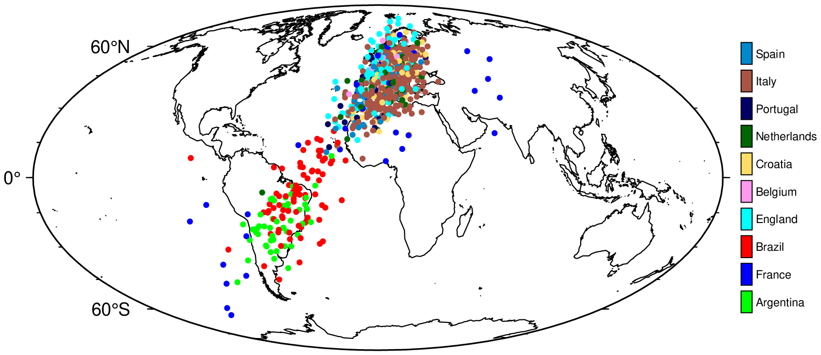
In our first example, we simulate this scenario, stopping short of training the model. In particular, we take the world_place.csv that was used in Gurnee and Tegmark (2023), which maps locations/areas to their latitude and longitude. For each place, it also indicates the corresponding country. From this, we take the subset that contains countries that are currently part of the top 10 FIFA world ranking, and assign the current rank to each country (i.e., Argentina gets 1, France gets 2, …). To ensure that the training data only involves a noisy version of the coordinates, we transform the longitude and latitude data as follows: \(\rho \cdot \text{coord} + (1-\rho) \cdot \epsilon\) where \(\rho=0.5\) and \(\epsilon \sim \mathcal{N}(0, 5)\).
In the process of writing the paper, most of the code has been moved into scripts in a designated repository to ensure reproducibility. The code for this example can be found here.
Next, we encode all features except the FIFA world rank indicator as continuous variables: \(X^{(n \times m)}\) where \(n\) is the number of samples and \(m\) is the number of resulting features. Additionally, we add a large number of random features to \(X\) to simulate the fact that not all features ingested by Llama-2 are necessarily correlated with geographical coordinates. Let \(d\) denote the final number of features, i.e.~\(d=m+k\) where \(k\) is the number of random features.
We then initialize a small neural network, considered a projector, mapping from \(X\) to a single hidden layer with \(h<d\) hidden units and sigmoid activation, and from there, to a lower-dimensional output space. Without performing any training on the projector, we simply compute a forward pass of \(X\) and retrieve activations \(\mathbf{Z}^{(n\times h)}\). Next, we perform the linear probe on a subset of \(\mathbf{Z}\) through Ridge regression: \(\mathbf{W} = (\mathbf{Z}_{\text{train}}'\mathbf{Z}_{\text{train}} + \lambda \mathbf{I}) (\mathbf{Z}_{\text{train}}'\textbf{coord})^{-1}\), where \(\textbf{coord}\) is the \((n \times 2)\) matrix containing the longitude and latitude for each sample. A hold-out set is reserved for testing, on which we compute predicted coordinates for each sample as \(\widehat{\textbf{coord}}=\mathbf{Z}_{\text{test}}\mathbf{W}\) and plot these on a world map (Figure 1).
If we can expect even random projections to contain useful representations, then should we really be surprised that a large language model, trained on a diverse set of data, contains representations that are useful for a wide range of tasks? 🤔
While the fit certainly is not perfect, the results do indicate that the random projection contains representations that are useful for the task at hand. Thus, this simple example illustrates that meaningful target representations should be recoverable from a sufficiently large latent space, given the random projection of a small number of highly correlated features. Similarly, Alain and Bengio (2018) observe that even before training a convolutional neural network on MNIST data, the layer-wise activations can already be used to perform binary classification. In fact, it is well-known that random projections can be used for prediction tasks (Dasgupta 2013).
PCA as a Yield Curve Interpreter
In response to the claims made by Tegmark, numerous commentators on social media have pointed out that even the simplest of models can exhibit structure in their latent spaces. One of the most popular and illustrative examples I remember from my time at the Bank of England is yield curve decomposition through PCA. The yield curve is a popular tool for investors and economists to gauge the health of the economy. It plots the yields of bonds against their maturities. The slope of the yield curve is often used as a predictor of future economic activity: a steep yield curve is associated with a growing economy, while a flat or inverted yield curve is associated with a contracting economy.
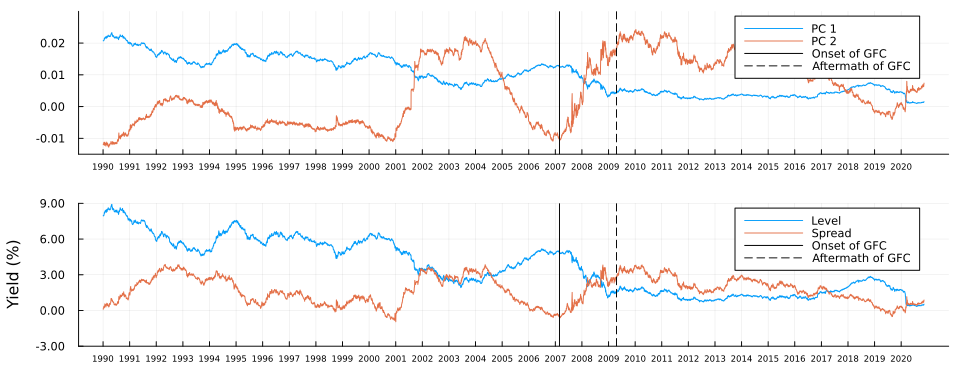
To understand this better, let us go on a quick detour into economics and look at actual yield curves observed in the US during the Global Financial Crisis (GFC). Figure 2 (a) shows the yield curve of US Treasury bonds on 27 February 2007, which according to CNN was a “brutal day on Wall Street”.2 This followed reports on the previous day of former Federal Reserve Chairman Alan Greenspan’s warning that the US economy was at risk of a recession. The yield curve was inverted with a sharp negative spread between the 10-year and 3-month yields, indicative of the market’s expectation of a recession.
Figure 2 (b) shows the corresponding yield curve during the aftermath of the GFC on 20 April 2009. On that day the influential Time Magazine reported that the “Banking Crisis is Over”. The yield curve was steeply sloped with a positive spread between the 10-year and 3-month yields, indicative of the market’s expectation of a recovery. The overall level of the yield curve was still very low though, indicative of the fact that US economy had not fully recovered at that point.
Code
df = CSV.read(joinpath(BLOG_DIR, "data/ust_yields.csv"), DataFrame) |>
    x -> @pivot_longer(x, -Date) |>
    x -> @mutate(x, variable=to_year(variable)) |>
    x -> @mutate(x, year=Dates.year(Date)) |>
    x -> @mutate(x, quarter=Dates.quarter(Date)) |>
    x -> @mutate(x, Date=Dates.format(Date, "yyyy-mm-dd")) |>
    x -> @arrange(x, Date) |>
    x -> @fill_missing(x, "down")
ylims = extrema(skipmissing(df.value))

# Peak-crisis:
onset_date = "2007-02-27"
plt_df = df[df.Date .== onset_date, :]
plt = plot(
    plt_df.variable, plt_df.value;
    label="", color=:blue,
    xlabel="Maturity (years)", ylabel="Yield (%)",
    size=(380, 350)
)
scatter!(
    plt_df.variable, plt_df.value;
    label="", color=:blue, alpha=0.5,
    ylims=(0,6)
)
display(plt)

# Post-crisis:
aftermath_date = "2009-04-20"
plt_df = df[df.Date .== aftermath_date, :]
plt = plot(
    plt_df.variable, plt_df.value;
    label="", color=:blue,
    xlabel="Maturity (years)", ylabel="Yield (%)",
    size=(380, 350)
)
scatter!(
    plt_df.variable, plt_df.value;
    label="", color=:blue, alpha=0.5,
    ylims=(0,6)
)
display(plt)Of course, US Treasuries are not the only bonds that are traded in the market. To get a more complete picture of the economy, analysts might therefore be interested in looking at the yield curves of other bonds as well. In particular, we might be interested in predicting economic growth based on the yield curves of many different bonds. The problem with that idea is that it is cursed by high dimensionality: we would end up modelling a single variable of interest (economic growth) with a large number of predictors (the yields of many different bonds). To deal with the curse of high dimensionality it can be useful to decompose the yield curves into sets of principal components.
To compute the principal components we can decompose the matrix of yields \(\mathbf{Y}\) into a product of its singular vectors and values: \(\mathbf{Y}=\mathbf{U}\Sigma\mathbf{V}^{\prime}\). I will not go into the details here, because Professor Gilbert Strang has already done a much better job than I ever could in his Linear Algebra lectures. To put this into the broader context of the article, however, let us simply refer to \(\mathbf{U}\), \(\Sigma\) and \(\mathbf{V}^{\prime}\) as latent embeddings of the yield curve (they are latent because they are not directly observable).
The top panel in Figure 3 shows the first two principal components of the yield curves of US Treasury bonds over time. Vertical stalks indicate the key dates during the onset and aftermath of the crisis, which we discussed above. For both components, we can observe some marked shifts between the two dates - but can we attribute any meaning to these shifts? It turns out we can: for comparison, the bottom panel in Figure 3 shows the average level and spread of the yield curves over time. The first principal component is strongly correlated with the level of the yield curve, while the second principal component is strongly correlated with the spread of the yield curve.
Not convinced? Let us use \(\mathbf{Y}=\mathbf{U}\Sigma\mathbf{V}^{\prime}\) in true autoencoder fashion to reconstruct yield curves from principal components. Let \(z_1\) denote the first principal component and consider the following: we keep all other \(M-1\) principal components fixed at zero where \(M\) denotes the total number of maturities; next we traverse the latent space by varying the value of \(z_1\) over a fixed grid of length \(K\) each time storing the full vector \(\mathbf{z}\); finally, we vertically concatenate the vectors and end up with a matrix \(\mathbf{Z}\) of dimension \((K \times M)\). To reconstruct yields, we simply multiply \(Z\) by the singular values and right singular vectors: \(\mathbf{Y}=\mathbf{Z}\Sigma\mathbf{V}^{\prime}\).
Figure 4 shows the result of this exercise in the left panel. As we can see, our generated yield curves shift vertically as we traverse the latent space. The right panel of Figure 4 shows the result of a similar exercise, but this time we keep the first principal component fixed at zero and vary the second principal component. This time the slope of our generated yield curves shifts as we traverse the latent space.
Code
n_vals = 50
pc1_range = range(extrema(U[:,1])..., length=n_vals)
pc2_range = range(extrema(U[:,2])..., length=n_vals)
Z_1 = [[pc1, 0, zeros(size(U, 2)-2)...] for pc1 in pc1_range] |> x -> reduce(vcat, x')
Y_1 = Z_1 * diagm(Σ) * V'
Z_2 = [[0, pc2, zeros(size(U, 2)-2)...] for pc2 in pc2_range] |> x -> reduce(vcat, x')
Y_2 = Z_2 * diagm(Σ) * V'
anim = @animate for i in 1:n_vals
    # Level shifts:
    y = Y_1[i,:]
    p1 = plot(
        unique(df.variable), y;
        label="", color=:blue,
        xlabel="Maturity (years)", ylabel="Yield (%)",
        title="PC1: $(round(collect(pc1_range)[i], digits=5))",
        ylims=extrema(Y_1)
    )
    scatter!(
        unique(df.variable), y;
        label="", color=:blue, alpha=0.5,
    )
    # Spread shifts:
    y = Y_2[i,:]
    p2 = plot(
        unique(df.variable), y;
        label="", color=:blue,
        xlabel="Maturity (years)", ylabel="Yield (%)",
        title="PC2: $(round(collect(pc2_range)[i], digits=5))",
        ylims=extrema(Y_2)
    )
    scatter!(
        unique(df.variable), y;
        label="", color=:blue, alpha=0.5,
    )
    plot(p1, p2, layout=(1,2), size=(1000, 400), left_margin=5mm, bottom_margin=5mm)
end
gif(anim, joinpath(BLOG_DIR, "results/figures/pc_anim.gif"), fps=5)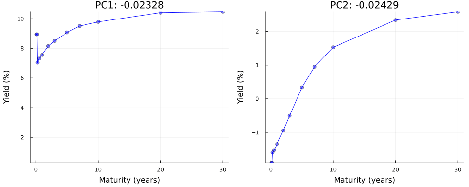
Autoencoders as Economic Growth Predictors
So far we have considered simple matrix decomposition. You might argue that principal components are not really latent embeddings in the traditional sense of deep learning. To address this, let us now consider a simple deep-learning example. Our goal will be to not only predict economic growth from the yield curve but also extract meaningful features at the same time. In particular, we will use a neural network architecture that allows us to recover a compressed latent representation of the yield curve.
Data
To estimate economic growth we will rely on a quarterly series of the real gross domestic product (GDP) provided by the Federal Reserve Bank of St. Louis. The data arrives in terms of levels of real GDP. In order to estimate growth, we will transform the data into log differences. Since our yield curve data is daily, we will need to aggregate it to the quarterly frequency. To do this, we will simply take the average of the daily yields for each maturity. We will also standardize yields since deep learning models tend to perform better with standardized data. Since COVID-19 was a huge structural break, we will also filter out all observations after 2018. Figure 5 shows the pre-processed data.
Code
df_gdp_full = CSV.read(joinpath(BLOG_DIR, "data/gdp.csv"), DataFrame) |>
    x -> @rename(x, Date=DATE, gdp=GDPC1) |>
    x -> @mutate(x, gdp_l1=lag(gdp)) |>
    x -> @mutate(x, growth=log(gdp)-log(gdp_l1)) |>
    x -> @select(x, Date, growth) |>
    x -> @mutate(x, year=Dates.year(Date)) |>
    x -> @mutate(x, quarter=Dates.quarter(Date))
df_gdp = df_gdp_full |>
    x -> @filter(x, year <= 2018)

df_yields_qtr = @group_by(df, year, quarter, variable) |>
    x -> @mutate(x, value=mean(value)) |>
    x -> @ungroup(x) |>
    x -> @select(x, -Date) |>
    unique

df_all = @inner_join(df_gdp, df_yields_qtr, (year, quarter)) |>
    x -> @pivot_wider(x, names_from=variable, values_from=value) |>
    dropmissing

y = df_all.growth |>
    x -> Float32.(x)
X = @select(df_all, -(Date:quarter)) |>
    Matrix |>
    x -> Float32.(x) |>
    x -> Flux.normalise(x; dims=1)

# Plot:
p_gdp = plot(
    df_all.Date, y;
    label="", color=:blue,
    size=(800,200),
    ylabel="GDP Growth (log difference)"
)
p_yields = plot(
    df_all.Date, X;
    label="", color=:blue,
    ylabel="Yield (standardized))",
    legend=:bottomright,
    alpha=0.5,
    size=(800,400)
)
plot(p_gdp, p_yields, layout=(2,1), size=(800, 600), left_margin=5mm)Model
Using a simple autoencoder architecture (Figure 6), we let our model \(g_t\) denote growth and our conditional \(\mathbf{r}_t\) the matrix of aggregated Treasury yield rates at time \(t\). Finally, we let \(\theta\) denote our model parameters. Formally, we are interested in maximizing the likelihood \(p_{\theta}(g_t|\mathbf{r}_t)\).
The encoder consists of a single fully connected hidden layer with 32 neurons and a hyperbolic tangent activation function. The bottleneck layer connecting the encoder to the decoder, is a fully connected layer with 6 neurons. The decoder consists of two fully connected layers, each with a hyperbolic tangent activation function: the first layer consists of 32 neurons and the second layer will have the same dimension as the input data. The output layer consists of a single neuron for our output variable, \(g_t\). We train the model over 1,000 epochs to minimize mean squared error loss using the Adam optimizer~.
Code
dl = Flux.MLUtils.DataLoader((permutedims(X), permutedims(y)), batchsize=24, shuffle=true)
input_dim = size(X,2)
n_pc = 6
n_hidden = 32
epochs = 1000
activation = tanh_fast
encoder = Flux.Chain(
    Dense(input_dim => n_hidden, activation),
    Dense(n_hidden => n_pc, activation),
)
decoder = Flux.Chain(
    Dense(n_pc => n_hidden, activation),
    Dense(n_hidden => input_dim, activation),
)
model = Flux.Chain(
    encoder.layers...,
    decoder.layers...,
    Dense(input_dim, 1),
)
plt = plot(model, rand(input_dim))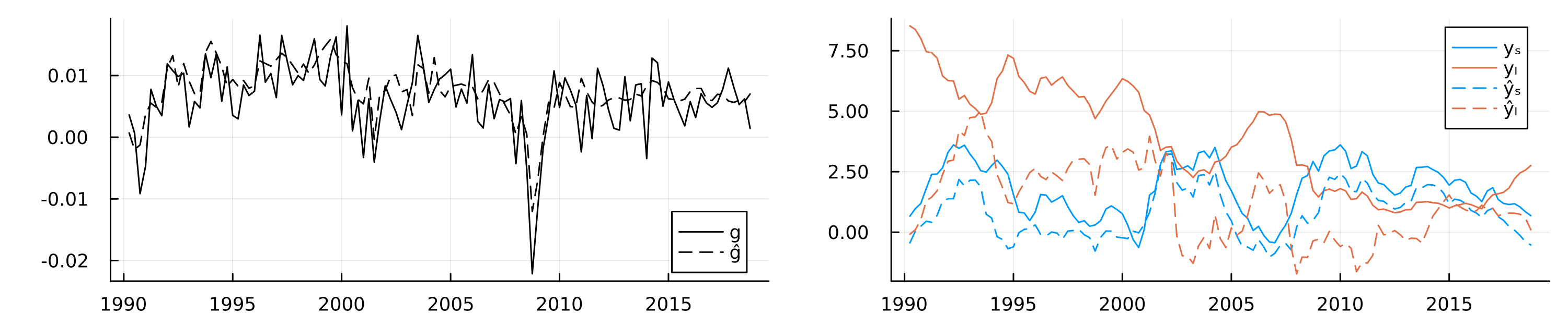
display(plt)The in-sample fit of the model is shown in the left chart of Figure 7, which shows actual GDP growth and fitted values from the autoencoder model. The model has a large number of free parameters and captures the relationship between economic growth and the yield curve reasonably well, as expected. Since our primary goal is not out-of-sample prediction accuracy but feature extraction for inference, we use all of the available data instead of reserving a hold-out set. As discussed above, we also know that the relationship between economic growth and the yield curve is characterized by two main factors: the level and the spread. Since the model itself is fully characterized by its parameters, we would expect that these two important factors are reflected somewhere in the latent parameter space.
Linear Probe
While the loss function applies most direct pressure on layers near the final output layer, any information useful for the downstream task first needs to pass through the bottleneck layer (Alain and Bengio 2018). On a per-neuron basis, the pressure to distill useful representation is therefore likely maximized there. Consequently, the bottleneck layer activations seem like a natural place to start looking for compact, meaningful representations of distilled information. I compute and extract these activations \(A_t\) for all time periods \(t=1,...,T\). Next, we use a linear probe to regress the observed yield curve factors on the latent embeddings. Let \(Y_t\) denote the vector containing the two factors of interest in time \(t\): \(y_{t,l}\) and \(y_{t,s}\) for the level and spread, respectively. Formally, we are interested in the following regression model: \(p_{w}(Y_t|A_t)\) where \(w\) denotes the regression parameters. I use Ridge regression with \(\lambda\) set to \(0.1\). Using the estimated regression parameters \(\hat{w}\), we then predict the yield curve factors from the latent embeddings: \(\hat{Y}_t=\hat{w}^{\prime}A_t\).
The in-sample predictions of the probe are shown in the right chart of Figure 7. Solid lines show the observed yield curve factors over time, while dashed lines show predicted values. We can observe that the latent embeddings predict the two yield curve factors reasonably well, in particular the spread.
Did the neural network now learn an intrinsic understanding of the economic relationship between growth and the yield curve? To me, that would be too big of a statement. Still, the current form of information distillation can be useful, even beyond its intended use for monitoring models.
For example, an interesting idea could be to use the latent embeddings as features in a more traditional and interpretable econometric model. To demonstrate this, let us consider a simple linear regression model for GDP growth. We might be interested in understanding to what degree economic growth in the past is associated with economic growth today. As we might expect, linearly regressing economic growth on lagged growth, as in column (1) of the table below, yields a statistically significant coefficient. However, this coefficient suffers from confounding bias since there are many other confounding variables at play, of which some may be readily observable and measurable, but others may not.
I already mentioned the relationship between interest rates and economic growth. To account for that, while keeping our regression model as parsimonious as possible, we could include the level and the spread of the US Treasury yield curve as additional regressors. While this slightly changes the estimated magnitude of the coefficient on lagged growth, the coefficients on the observed level and spread are statistically insignificant (column (2) in the table). This indicates that these measures may be too crude to capture valuable information about the relationship between yields and economic growth. Because we have included two additional regressors with little to no predictive power, the model fit as measured by the Bayes Information Criterium (BIC) has actually deteriorated.
Column (3) of the table shows the effect of instead including one of the latent embeddings that we recovered above in the regression model. In particular, we pick the one latent embedding that we have found to exhibit the most significant effect on the output variable in a separate regression of growth on all latent embeddings. The estimated coefficient on this latent factor is small in magnitude, but statistically significant. The overall model fit, as measured by the BIC has improved and the magnitude of the coefficient on lagged growth has changed quite a bit. While this is still a very incomplete toy model of economic growth, it appears that the compact latent representation we recovered can be used in order to mitigate confounding bias.
LLMs for Economic Sentiment Prediction
To round up this section, we will jump back on the hype train and consider an example involving an LLM. In particular, we will closely follow the approach in Gurnee and Tegmark (2023) and apply it to a novel financial dataset: the Trillion Dollar Words dataset introduced by Shah, Paturi, and Chava (2023). The dataset contains a curated selection of sentences formulated by central bankers of the US Federal Reserve and communicated to the public in speeches, meeting minutes and press conferences. The authors of the paper use this dataset to train LLMs to classify sentences as either ‘dovish’, ‘hawkish’ or ‘neutral’. To this end, they first manually annotate a subsample of the available data and then fine-tune various foundation models. Their model of choice, FOMC-RoBERTa (a fine-tuned version of RoBERTa (Liu et al. 2019)), achieves an \(F_1\) score of around \(>0.7\) for the classification task. To illustrate the potential usefulness of the learned classifier, they use predicted labels for the entire dataset to compute an ad-hoc, count-based measure of ‘hawkishness’. They then go on to show that this measure correlates with key economic indicators in the expected direction: when inflationary pressures rise, the measured level of ‘hawkishness’ increases as central bankers need to raise interest rates to bring inflation back to target.
Linear Probes
Instead of computing a measure based on predicted labels, we can use linear probes to assess if the fine-tuned model has learned associative patterns between central bank communications and key economic indicators. To this end, I have further pre-processed the data provided by Shah, Paturi, and Chava (2023) and used their proposed model to compute layer-wise embeddings for all available sentences. I have made these available and easily accessible through a small Julia package: TrillionDollarWords.jl. For each layer, I have then computed linear probes on two inflation indicators—the Consumer Price Index (CPI) and the Producer Price Index (PPI)—as well as US Treasury yields at different levels of maturity. To mitigate issues related to over-parameterization, I follow the recommendation in Alain and Bengio (2018) to first reduce the dimensionality of the embeddings each time. In particular, linear probes are restricted to the first 128 principal components of the embeddings of each layer.
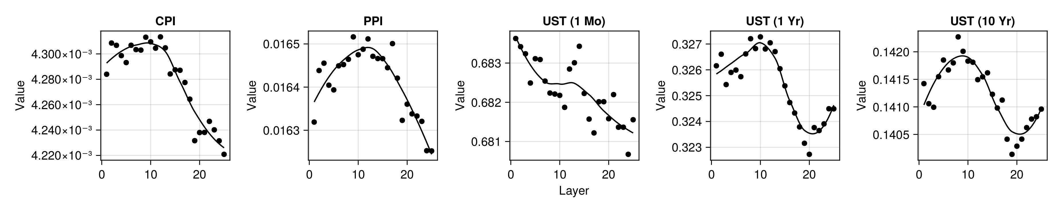
Figure 8 shows the out-of-sample root mean squared error (RMSE) for the linear probe, plotted against FOMC-RoBERTa’s \(n\)-th layer. The values correspond to averages across cross-validation folds where I have used an expanding window scheme. Consistent with related work Gurnee and Tegmark (2023), we can observe that model performance tends to be higher for layers near the end of the transformer model. Curiously, for yields at longer maturities, we see that performance eventually deteriorates for the very final layers. This is not the case for the training data, so I would attribute this to overfitting. A detailed discussion of all our results including a benchmark of these probes against baseline autoregressive models can be found in the paper.
Stochastic Parrots After All?
These results from the linear probe shown in Figure 8 are certainly not unimpressive: even though FOMC-RoBERTa was not explicitly trained to uncover associations between central bank communications and prices, it appears that the model has distilled representations that can be used to predict inflation and yields. It is worth pointing out here that this model is substantially smaller than the models tested in Gurnee and Tegmark (2023). This begs the following question:
Have we uncovered further evidence that LLMs “aren’t mere stochastic parrots”? Has FOMC-RoBERTa developed an intrinsic understanding of the economy just by ‘reading’ central bank communications?
Personally, I am having a very hard time believing this. To argue my case, I will now produce a counter-example demonstrating that, if anything, these findings are very much in line with the parrot metaphor. The counter-example is based on the following premise: if the results from the linear probe truly were indicative of some intrinsic understanding of the economy, then the probe should not be sensitive to random sentences that are most definitely not related to consumer prices.
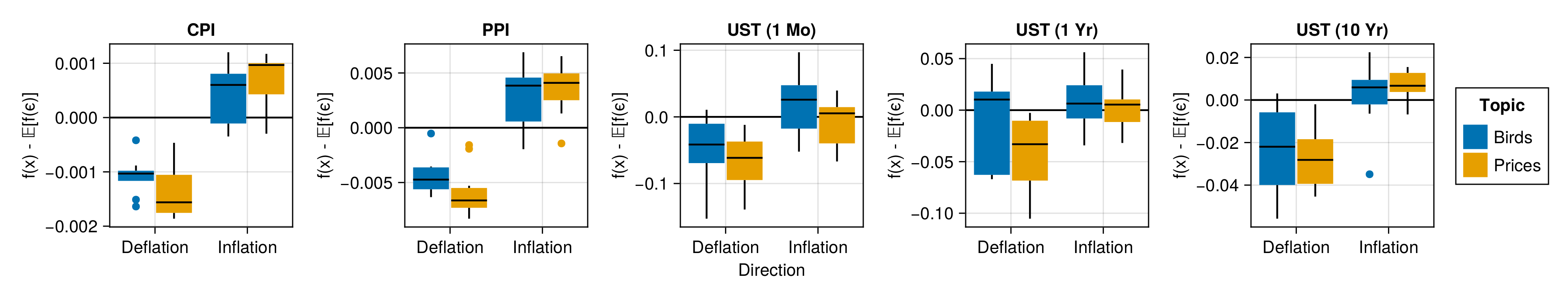
To test this, I select the best-performing probe trained on the final-layer activations to predict changes in the CPI. I then make up sentences that fall into one of these four categories: Inflation/Prices (IP)—sentences about price inflation, Deflation/Prices (DP)—sentences about price deflation, Inflation/Birds (IB)—sentences about inflation in the number of birds and Deflation/Birds (DB)—sentences about deflation in the number of birds. A sensible sentence for category DP, for example, could be: “It is essential to bring inflation back to target to avoid drifting into deflation territory.”. Analogically, we could construct the following sentence for the DB category: “It is essential to bring the numbers of doves back to target to avoid drifting into dovelation territory.”.
In light of the encouraging results for the probe in Figure 8, we should expect the probe to predict higher levels of inflation for activations for sentences in the IP category than for sentences in the DP category. If this was indicative of true intrinsic understanding, we would not expect to see any significant difference in predicted inflation levels for sentences about birds, independent of whether or not their numbers are increasing. More specifically, we would not expect the probe to predict values for sentences about birds that are substantially different from the values it can be expected to predict when using actual white noise as inputs.
To get to this last point, I also generate many probe predictions for samples of noise. Let \(f: \mathcal{A}^k \mapsto \mathcal{Y}\) denote the linear probe that maps from the \(k\)-dimensional space spanned by \(k\) first principal components of the final-layer activations to the output variable of interest (CPI growth in this case). Then I sample \(\varepsilon_i \sim \mathcal{N}(\mathbf{0},\mathbf{I}^{(k \times k)})\) for \(i \in [1,1000]\) and compute the sample average. I repeat this process \(10000\) times and compute the median-of-means to get an estimate for \(\mathbb{E}[f(\varepsilon)]=\mathbb{E}[y|\varepsilon]\), that is the predicted value of the probe conditional on white noise.
Next, I propose the following hypothesis test as a minimum viable testing framework to assess if the probe results (may) provide evidence for an actual understanding of key economic relationships learned purely from text:
Proposition 1 (Parrot Test)
- H0 (Null): The probe never predicts values that are statistically significantly different from \(\mathbb{E}[f(\varepsilon)]\).
- H1 (Stochastic Parrots): The probe predicts values that are statistically significantly different from \(\mathbb{E}[f(\varepsilon)]\) for sentences related to the outcome of interest and those that are independent (i.e. sentences in all categories).
- H2 (More than Mere Stochastic Parrots): The probe predicts values that are statistically significantly different from \(\mathbb{E} [f(\varepsilon)]\) for sentences that are related to the outcome variable (IP and DP), but not for sentences that are independent of the outcome (IB and DB).
To be clear, if in such a test we did find substantial evidence in favour of rejecting both HO and H1, this would not automatically imply that H2 is true. But to even continue investigating if based on having learned meaningful representation the underlying LLM is more than just a parrot, it should be able to pass this simple test.
In this particular case, Figure 9 demonstrates that we find some evidence to reject H0 but not H1 for FOMC-RoBERTa. The median linear probe predictions for sentences about inflation and deflation are indeed substantially higher and lower, respectively than for random noise. Unfortunately, the same is true for sentences about the inflation and deflation in the number of birds, albeit to a somewhat lower degree.
I should note that the number of sentences in each category is very small here (10), so the results in Figure 9 cannot be used to establish statistical significance. That being said, even a handful of convincing counter-examples should be enough for us to seriously question the claim that results from linear probes provide evidence against the parrot metaphor. In fact, even a handful of sentences for which any human annotator would easily arrive at the conclusion of independence, a prediction by the probe in either direction casts doubt.
Conclusion
Linear probes and related tools from mechanistic interpretability were proposed in the context of monitoring models and diagnosing potential problems Alain and Bengio (2018). Favorable outcomes from probes merely indicate that the model “has learned information relevant for the property [of interest]” Belinkov (2021). The examples shown here demonstrate that this is achievable even for small models, while these have certainly not developed an intrinsic “understanding” of the world. Thus, my co-authors and I argue that more conservative and rigorous tests for emerging capabilities of AI model are needed.
I want to conclude this blog post just as we conclude in our paper:
“We as academic researchers carry great responsibility for how the narrative will unfold, and what claims are believed. We call upon our colleagues to be explicitly mindful of this. As attractive as it may be to beat the state-of-the-art with a grander claim, let us return to the Mertonian norms, and thus safeguard our academic legitimacy in a world that only will be eager to run with made claims.”
— Altmeyer et al. (2024)
Acknowledgements
A huge thank you to my co-authors Andrew M. Demetriou, Antony Bartlett and Cynthia C. S. Liem who are also my colleagues at TU Delft and (in the case of Cynthia) my supervisor. It’s been a real pleasure working with you on this project.
References
Footnotes
Citation
@online{altmeyer2024,
  author = {Altmeyer, Patrick and Altmeyer, Patrick},
  title = {Spurious {Sparks} of {AGI}},
  date = {2024-02-07},
  url = {https://www.paltmeyer.com/blog//blog/posts/spurious-sparks},
  langid = {en}
}